Challenge
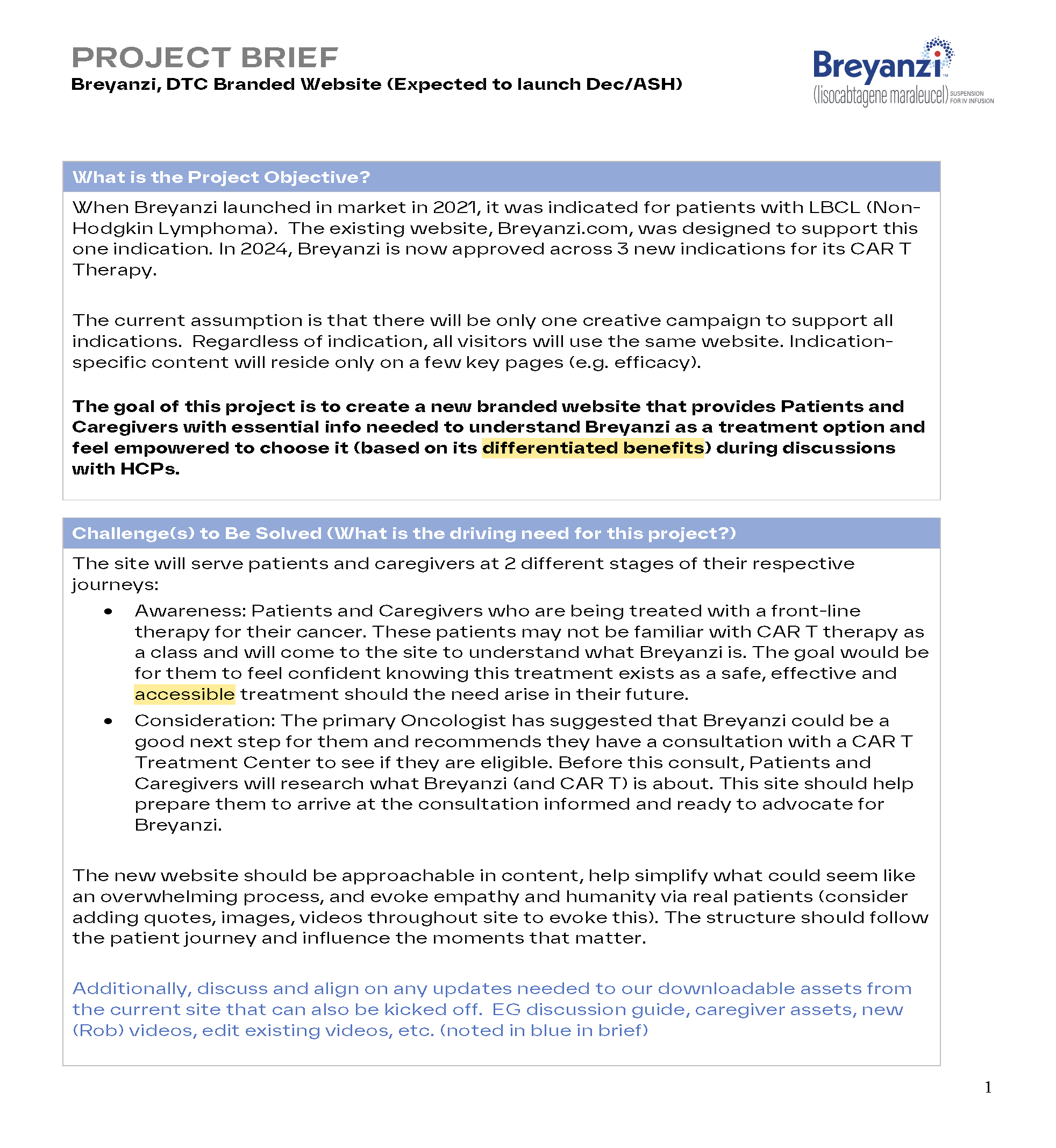
When Breyanzi launched in market in 2021, it was indicated for patients with LBCL (Non Hodgkin Lymphoma). The existing website, Breyanzi.com, was designed to support this one indication. By 2024, Breyanzi was approved across 3 new indications for its CAR T Therapy. A “One Breyanzi” straegic and creative campaign was developed to support all indications. To support this the website, the central hub in the brand ecosystem, needed to be updated. In addition, BMS was launching a new proprietary CMS and component system. Our team would be the first to create a website using this new untested system.
SOLUTIONS
Discover & Define: Prior to project kickoff of design, I led the following discovery actions:
Our newly formed CX group conducted a workshop with client stakeholders to define the overall website objective, strategy, KPIs, and approach to information architecture.
We built strong relationships with BMS’ BuildEasy IT, Brand, and Omnichannel teams, creating a workflow to collaborate on the site, address issues, and find solutions.
Aligned the internal agency team on workflow steps, roles and responsibilities and deliverables.
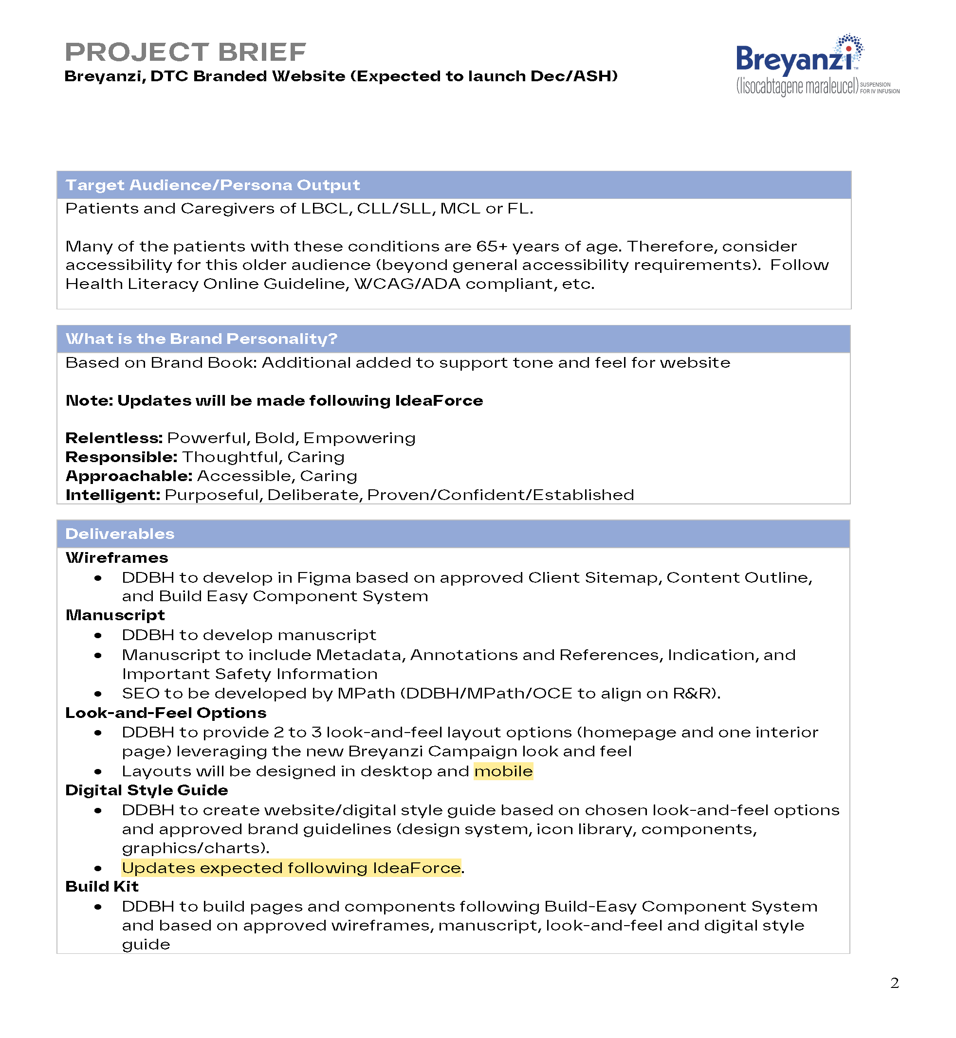
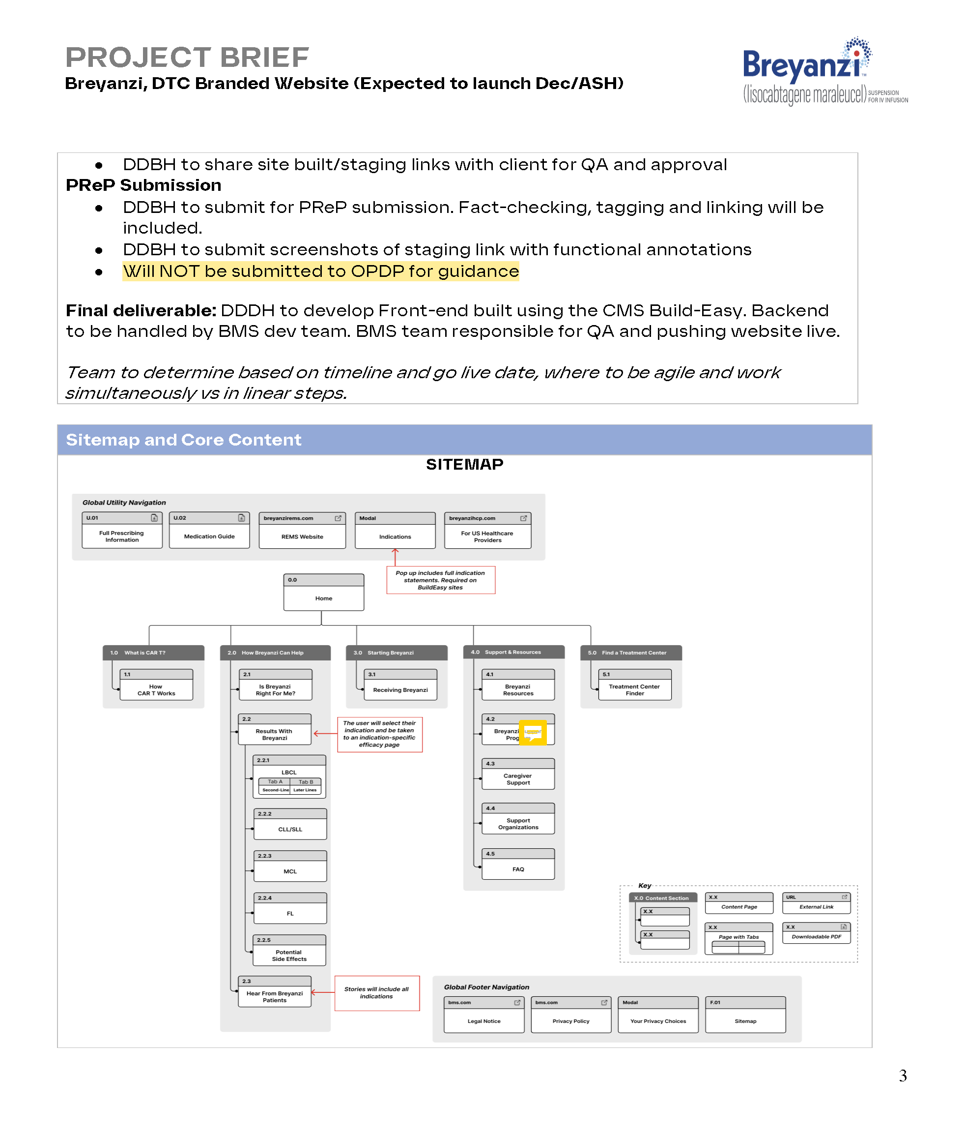
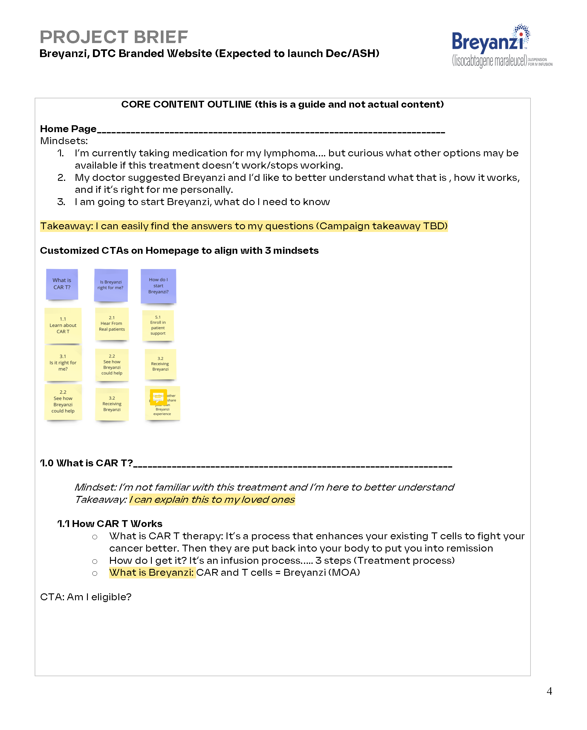
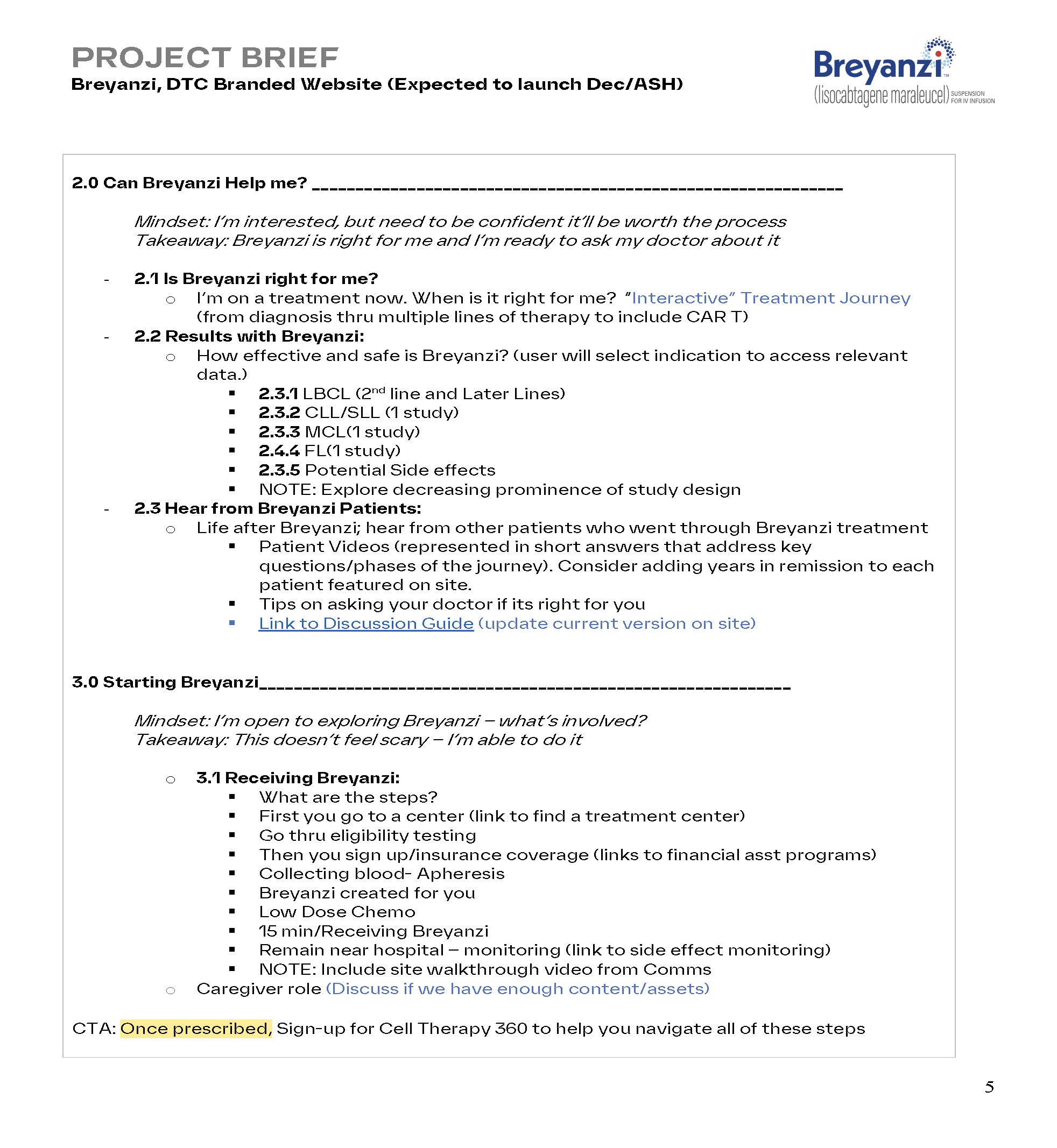
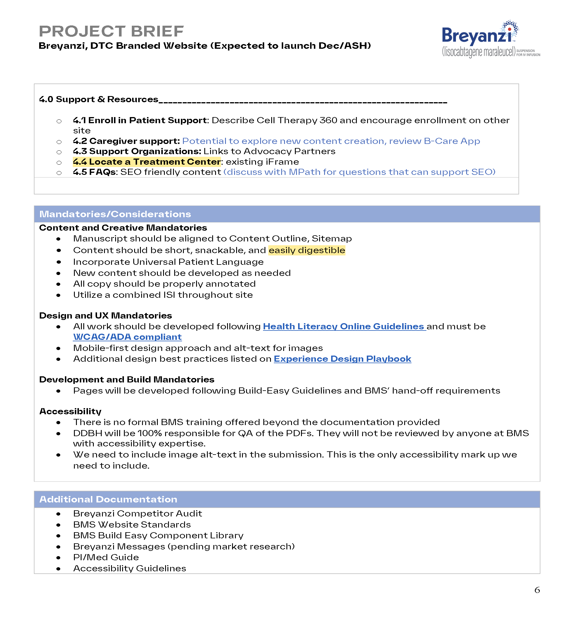
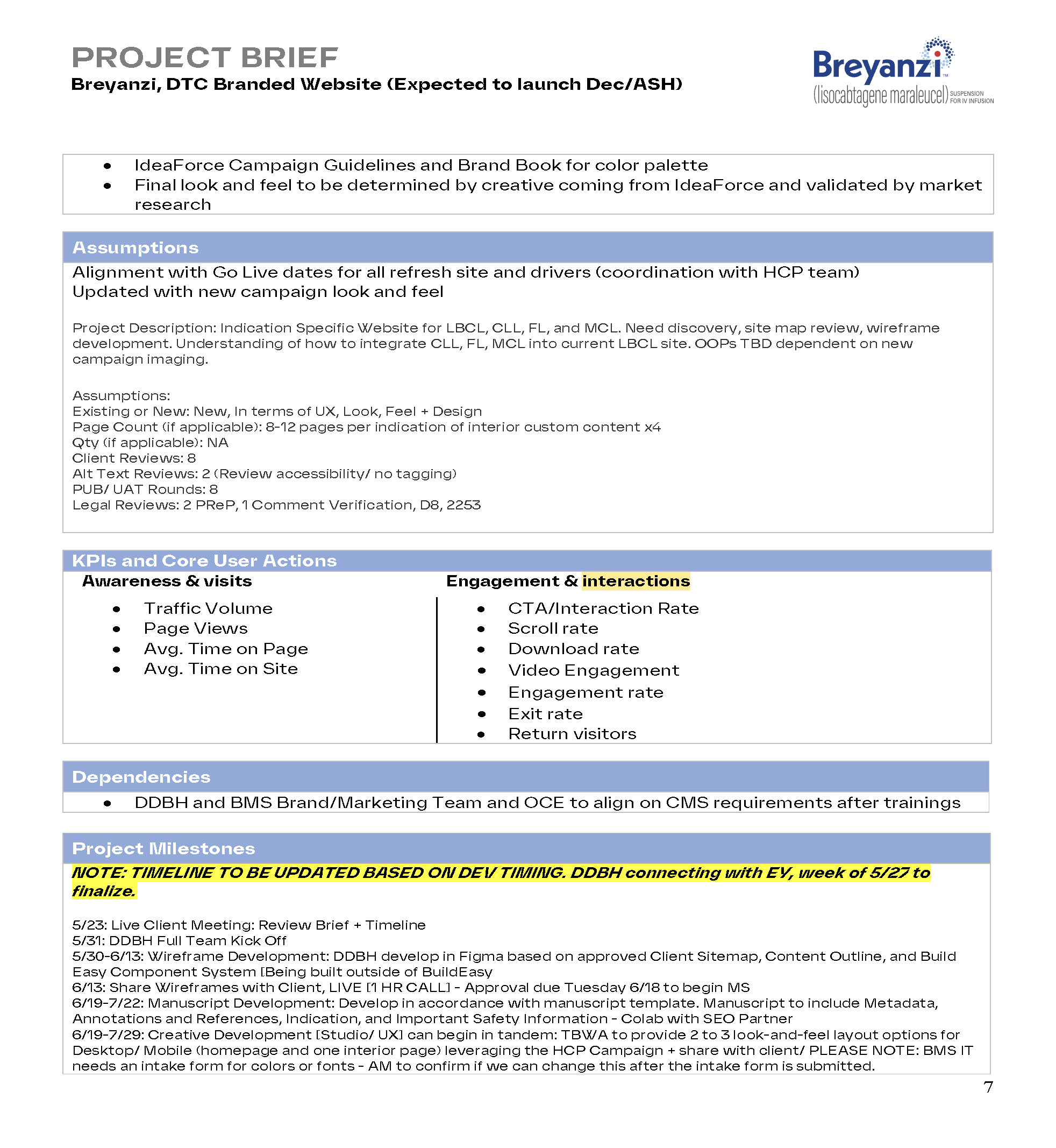
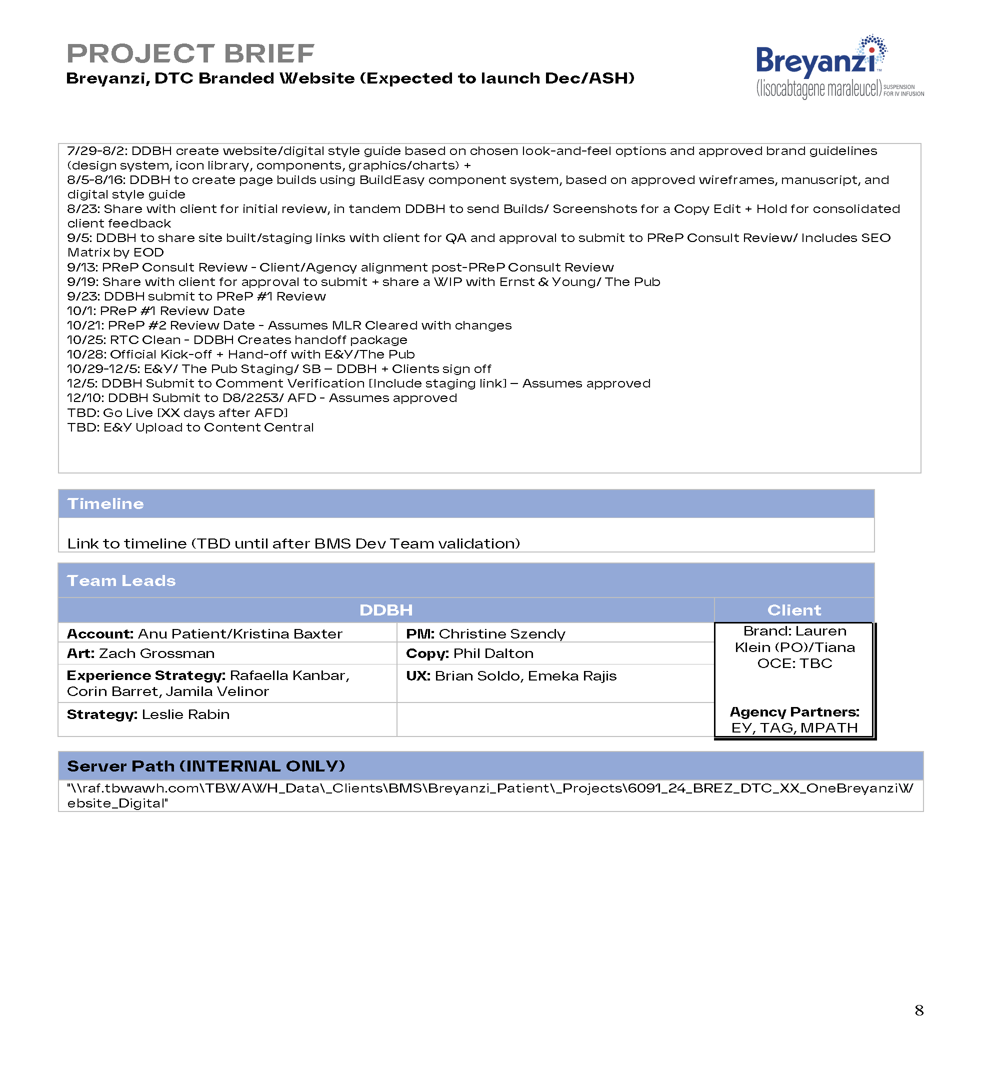
The output of these actions informed the creation of the project brief co-authored by me and shown here.
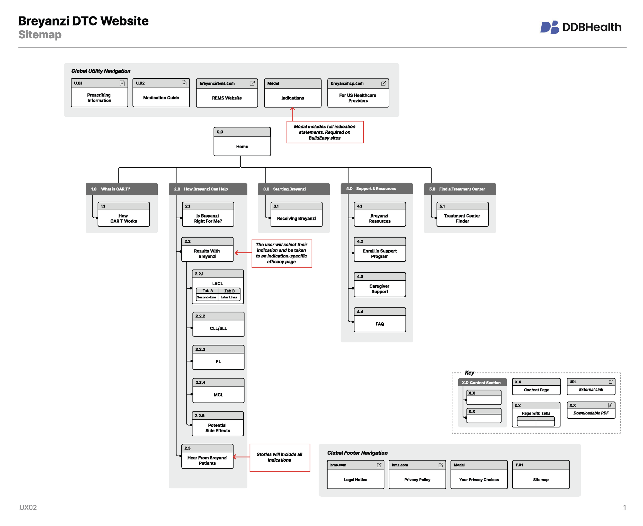
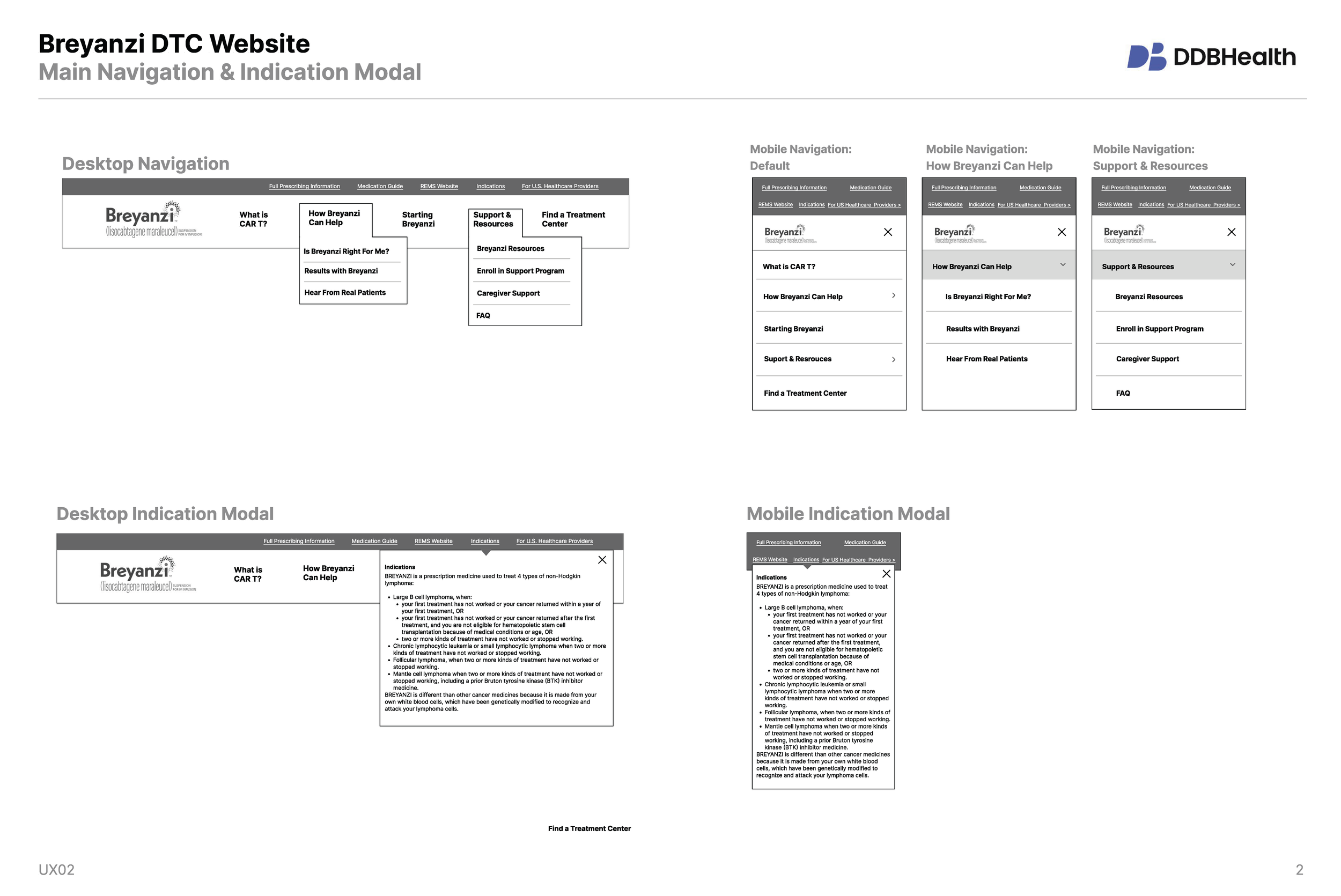
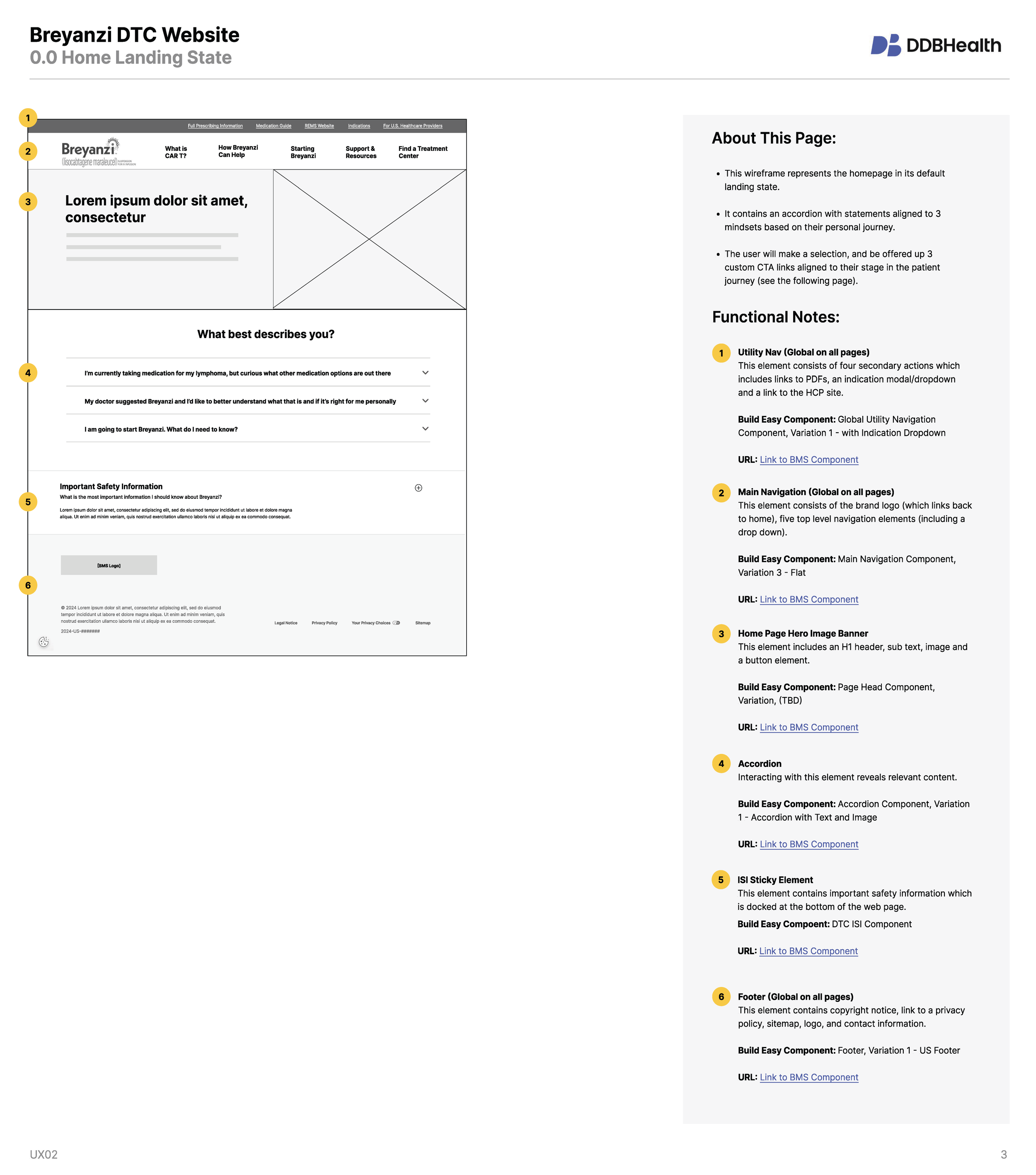
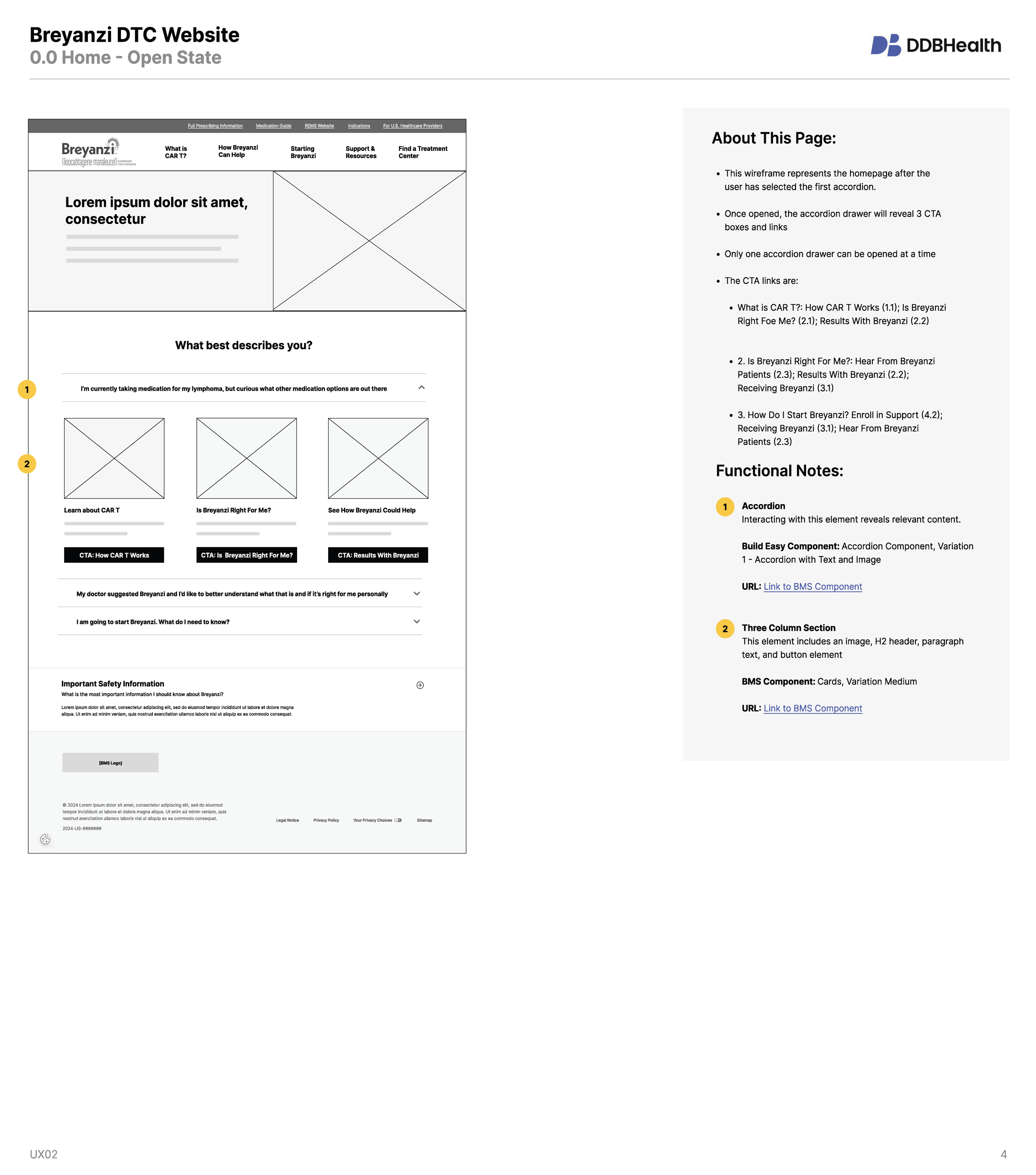
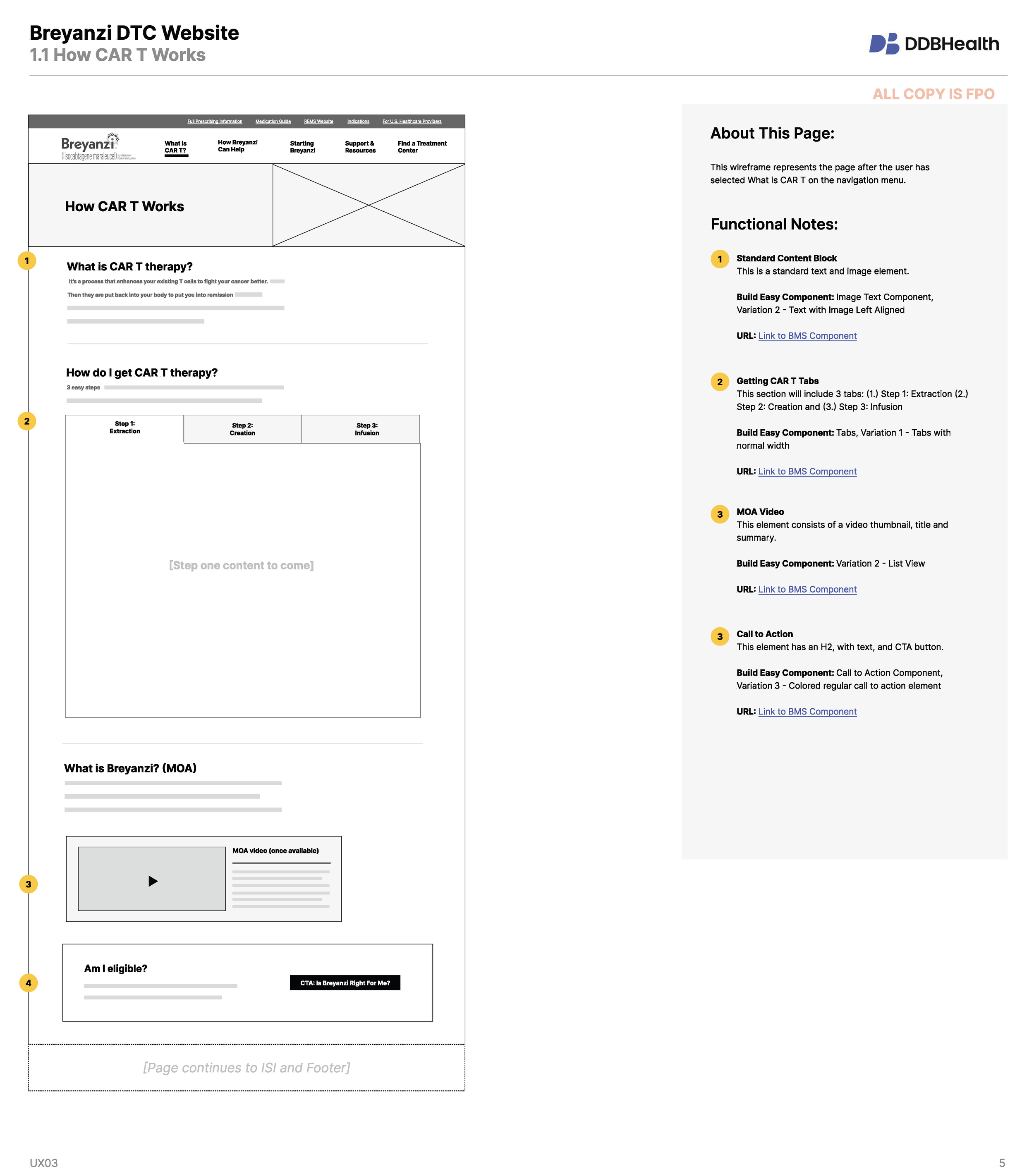
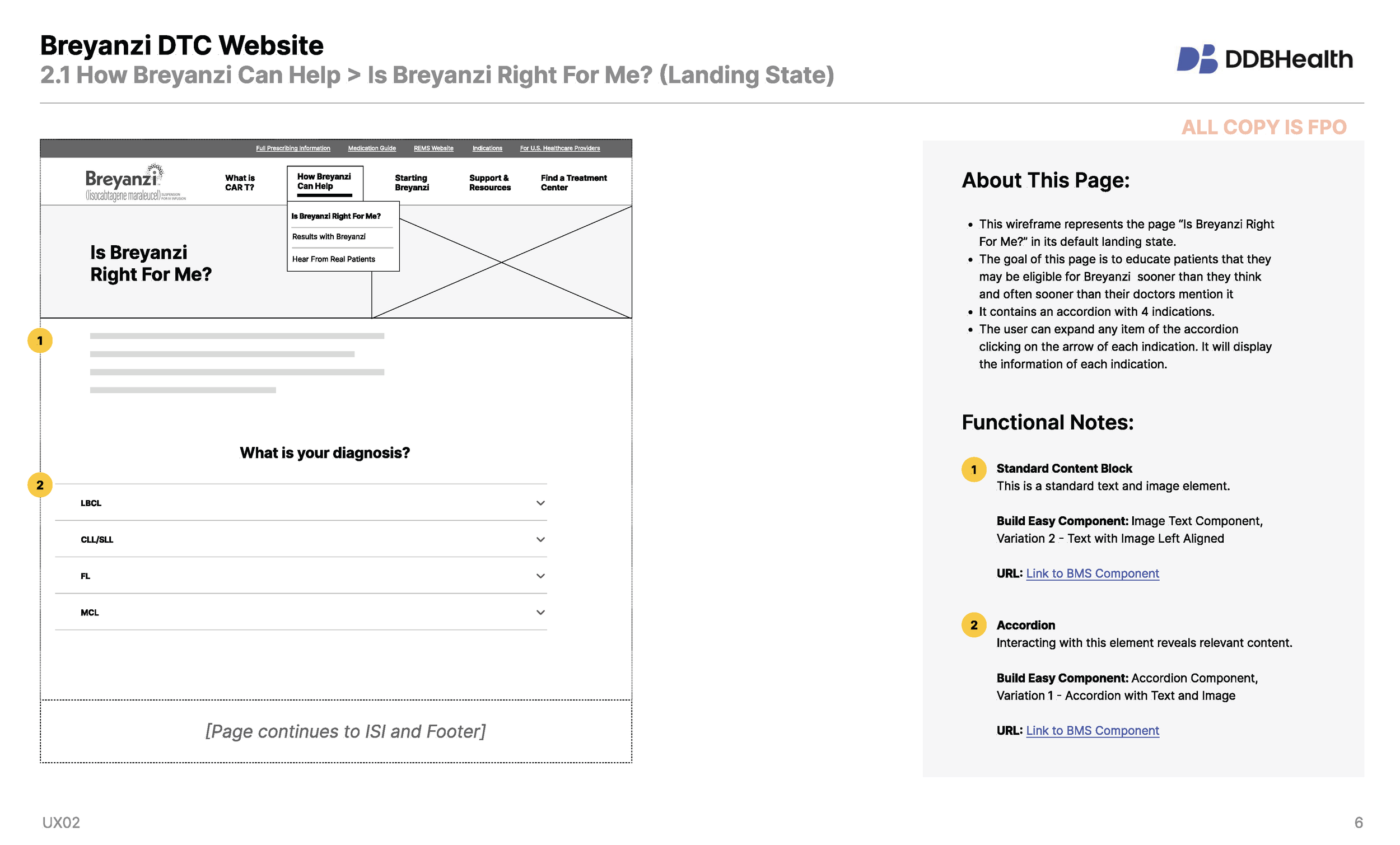
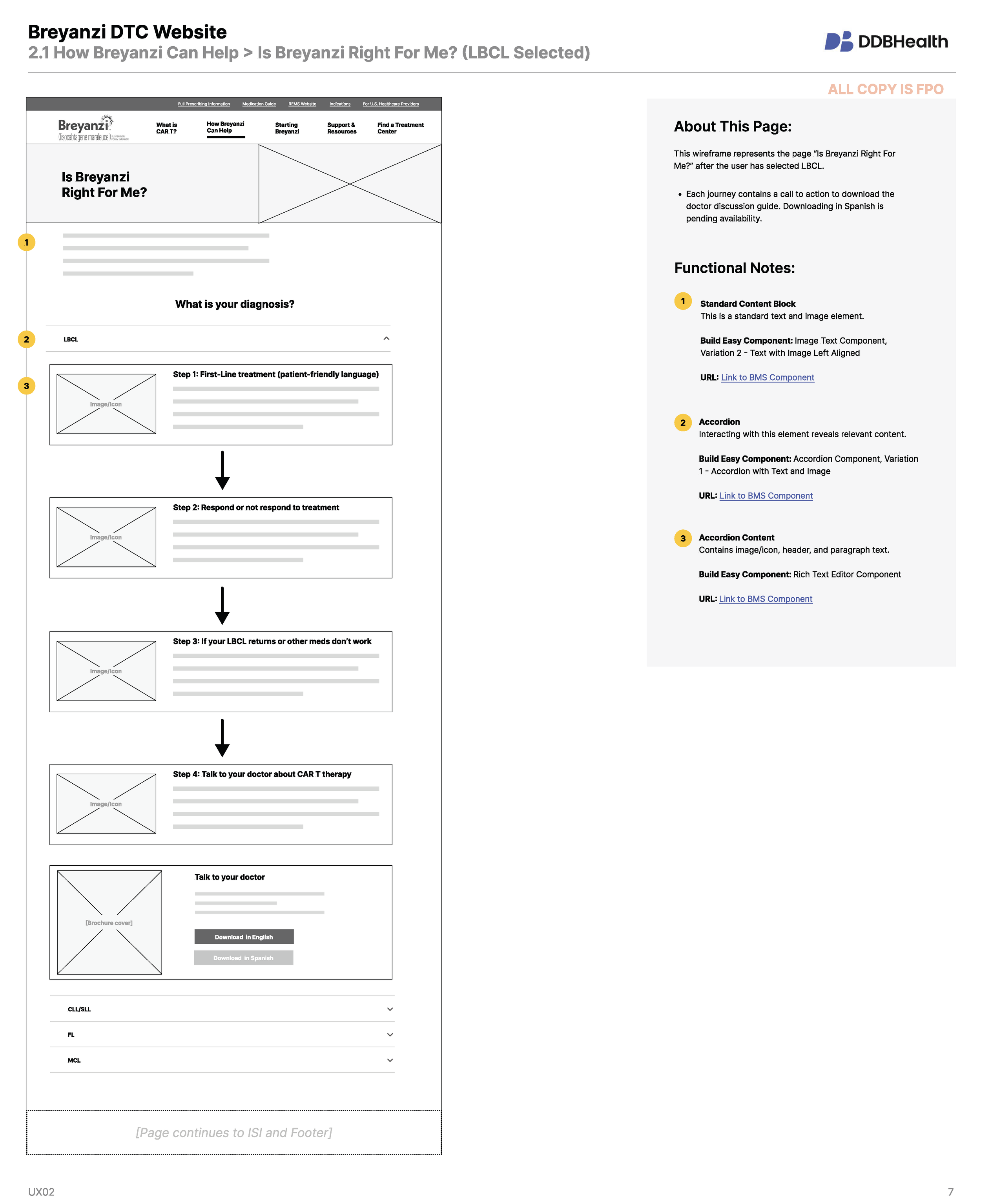
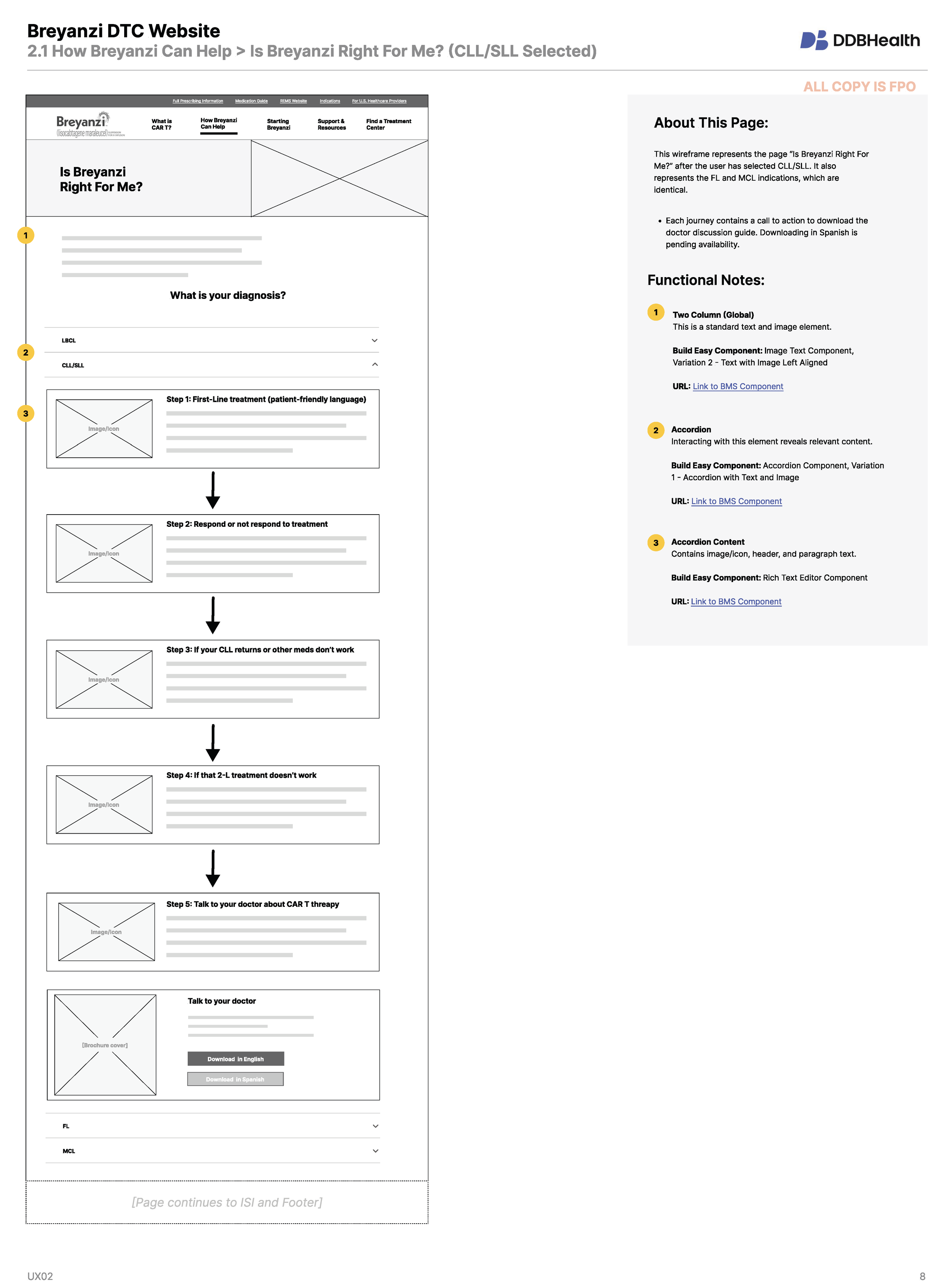
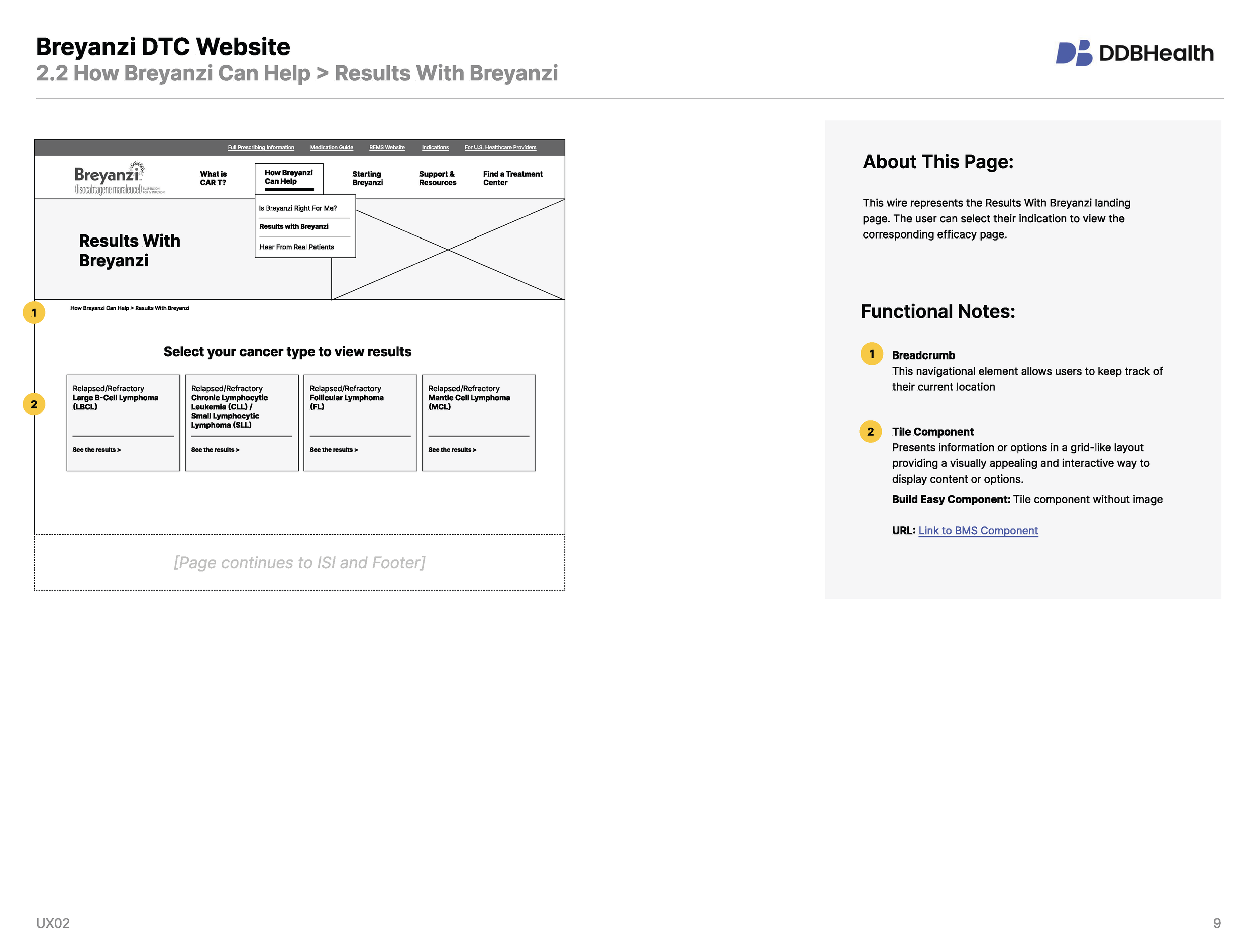
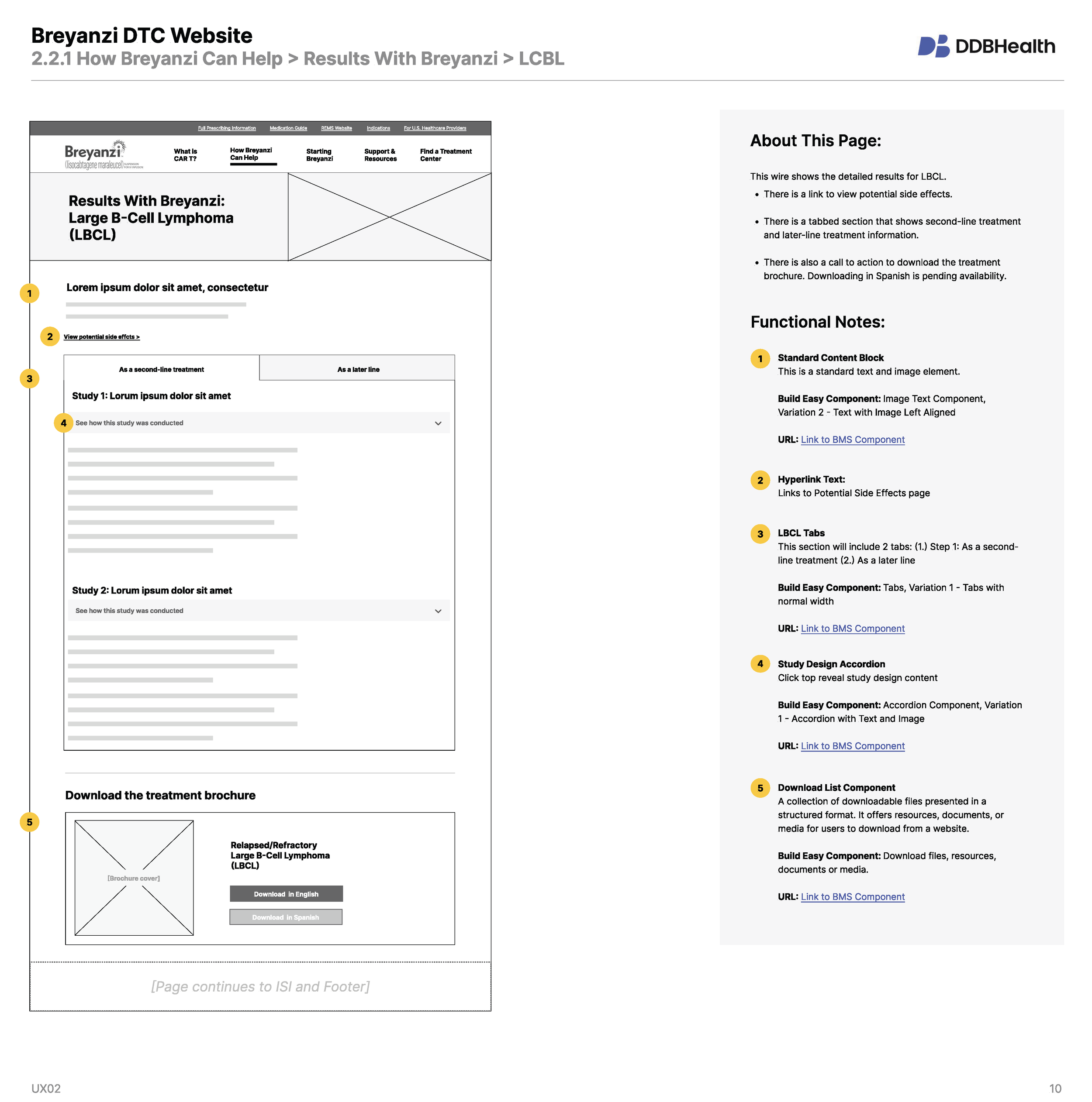
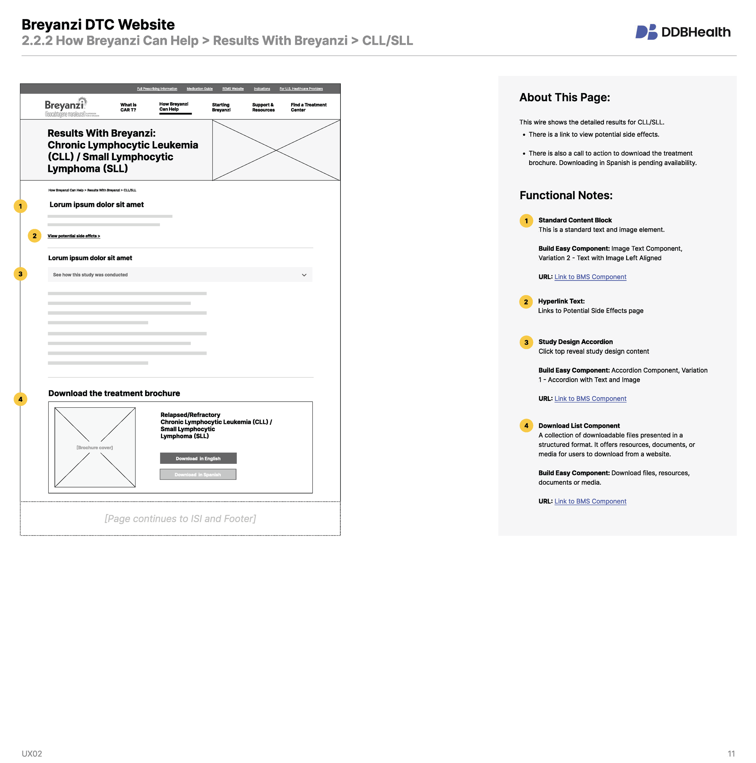
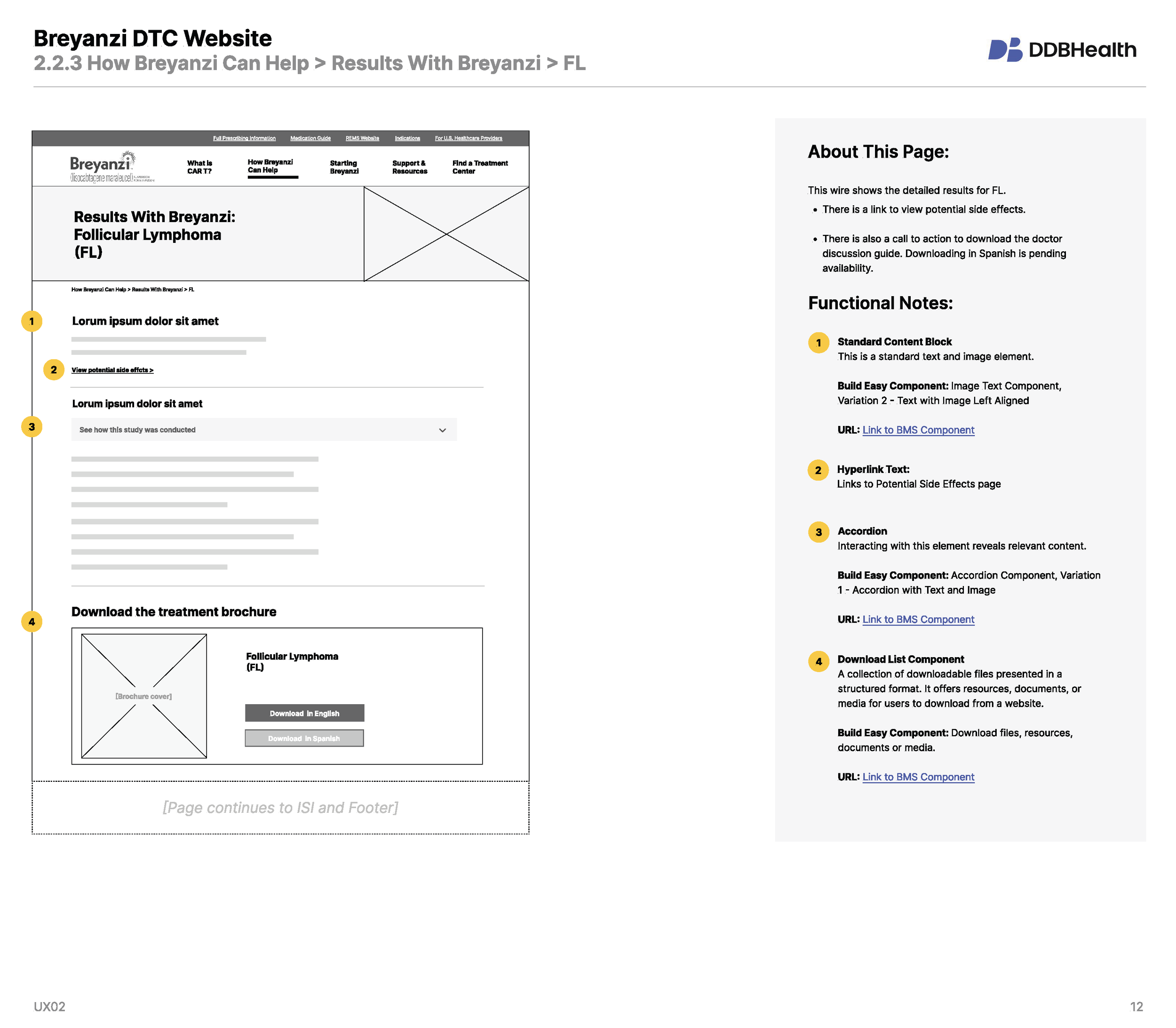
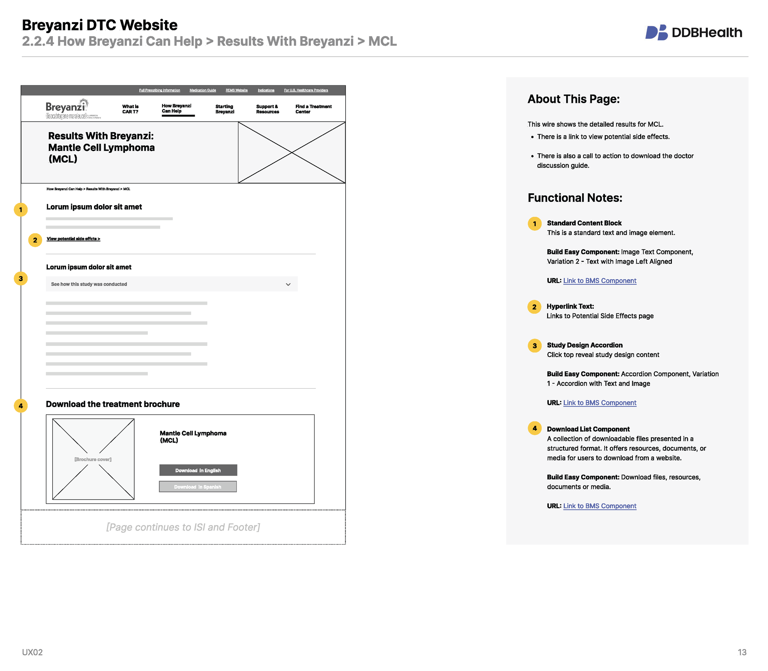
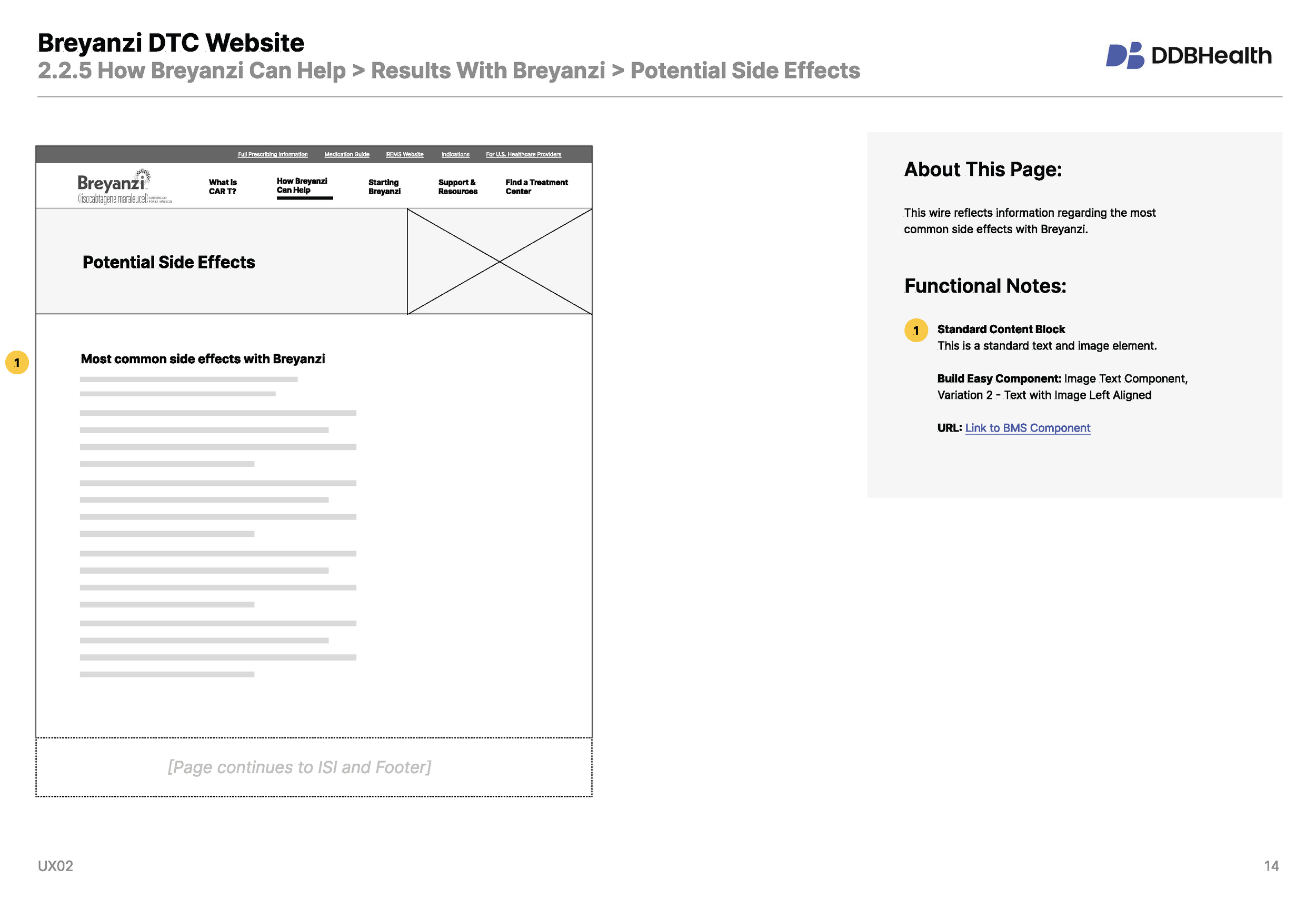
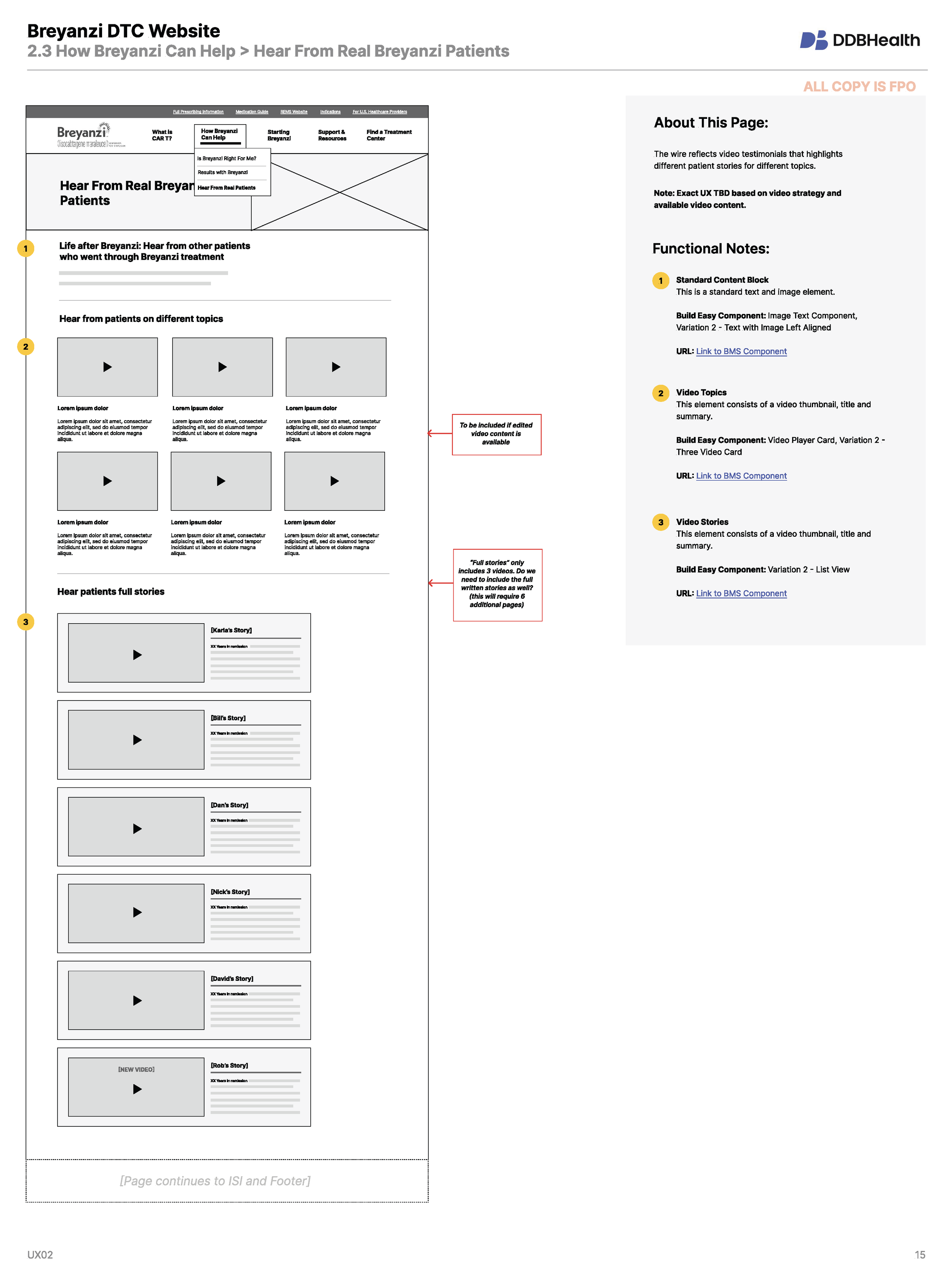
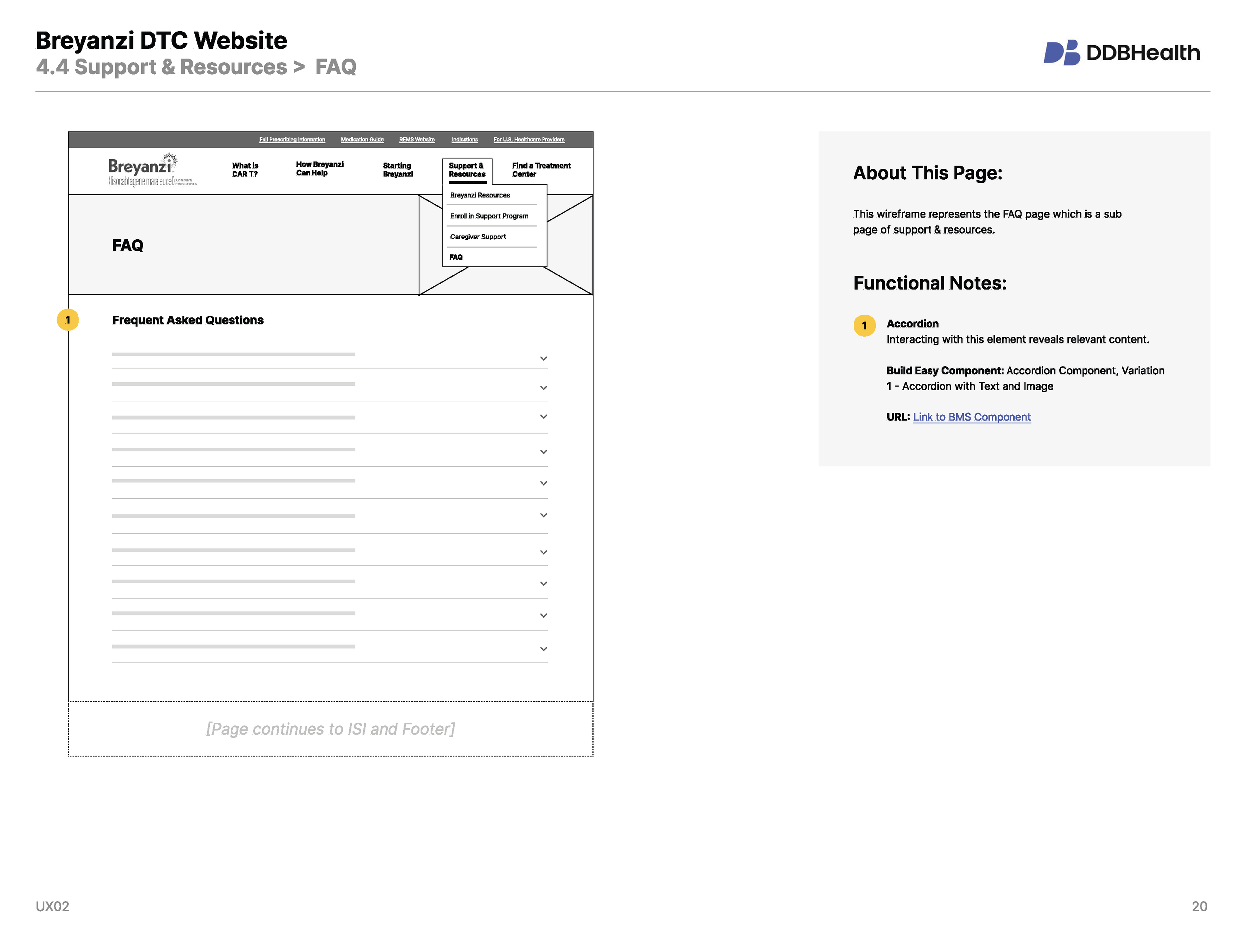
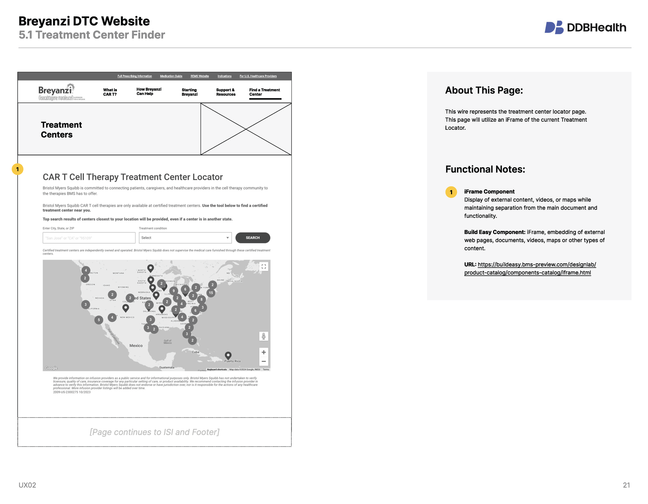
Design: My team and I created the low-fidelity wireframes shown below. The wires defined the website’s content strategy and mapped to a copy deck and asset matrix. They also mapped to carefully selected BuildEasy components allowing for clear development. My team quickly adapted to the new system, finding shortcuts and optimizations along the way. with BMS’ IT team to define ways of working in the new CMS (and working around its limitations).
OUTCOME
Clinet Satisfaction
Our BMS clients were impressed with the talents of our team, the efficiency of the work, and the ultimate design of the site. This led to 3 additional site updates adding new content and features as well as the additionl business of the HCP site redesign.
User Satisfaction
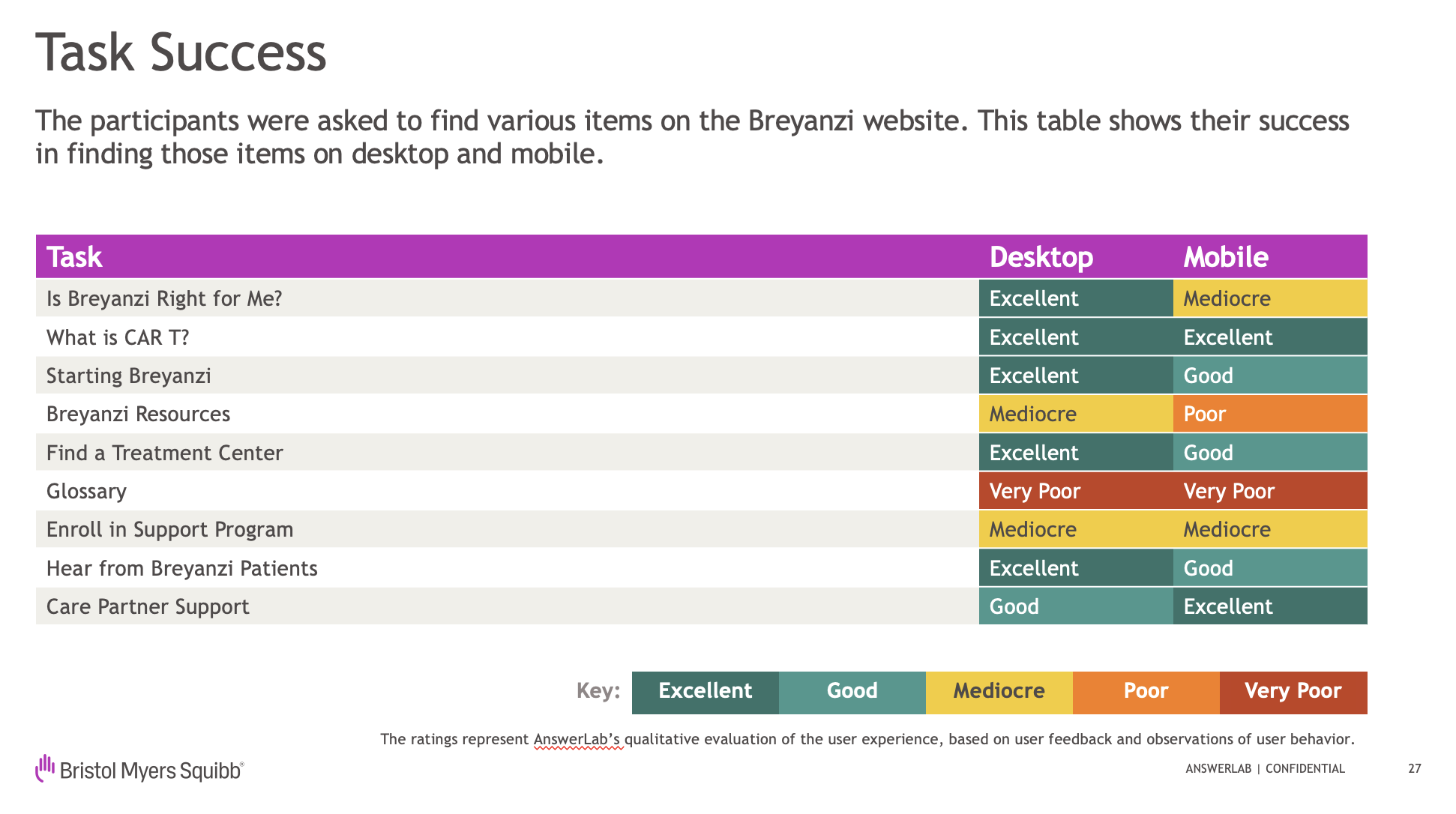
In 2025, I worked with a research vendor (Answerlab), to define the approach for 22 in-depth sessions with 16 patients and 6 caregivers subjects. The site’s UX and content strategy tested exceptionally well!
Navigation: Most found the navigation menus to be simple and easy to use, with mostly intuitive link labels.
Information: Some felt the site had a lot of good information, which drew their attention and made them want to learn more.
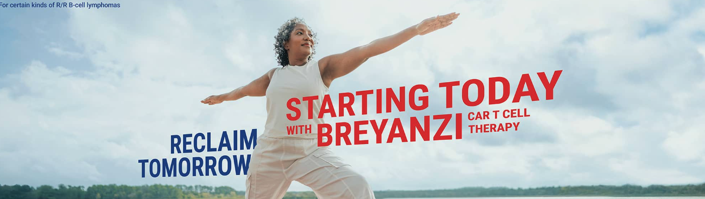
Visual appeal: Some felt the site was visually appealing, and a few liked the hero image. However, more disliked it because they felt it looked like a typical marketing photo of an actor, rather than a real patient.
User Tasks: Most user tasks were completed successfully (except for the regulatory-required glossary, which was deliberately made hard to find)
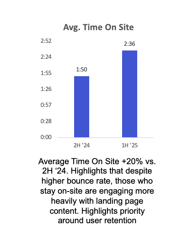
Success Shown in Analytics 6 Months Post Launch
Time on Site on site up 20%
Effectiveness at guiding patients actively in research mode as seen by lower bounce rates via Paid Search, Direct and SEO.
The critical “What is CAR T” page was among the most read.
Heavy use of key site features, including the Treatment Center Finder, Patient Journey navigation, and Patient Story videos.
“Thanks to the new One Breyanzi website, we have a clear understanding of where and how to put more patients in the driver’s seat of their CAR T journey with Breyanzi.”